In this post, we are going to create room cards in Home Assistant to easily control the status of the devices at a glance.
Previously, we have used specific examples like occupancy cards or the Smart TV card, but in this case, the goal is to concentrate all the information into a small card. For me, this is ideal for rooms like the bedroom or living room, where we spend a lot of time but have limited devices (so we don’t want to create a dedicated section on the lovelace panel).
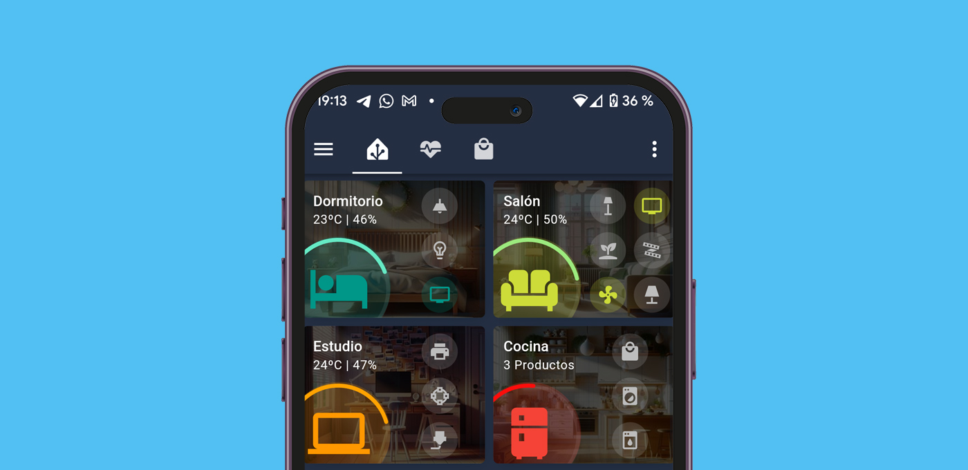
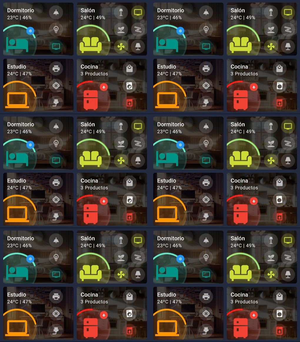
In the end, you will have cards that look like this:
Índice
Requirements
If you want to build this card, consider this:
- To create the card, you need to install the Mushroom Cards, Card-mod, Stack in card, and ApexCharts Card through HACS.
- If you are going to control Zigbee bulbs that you frequently turn on and off with wall switches, I recommend checking out this trick to display the actual status of your Zigbee bulbs. This will prevent them from showing as «on» when they are turned off via the switch.
- You can copy and paste the code at the end of the post, but you are also free to modify it however you like.
Building the Card
To create the room cards, we will consider their different parts.
Card Header
First, we can configure the background image. For this, you can use a real image of your rooms, or even generate them with artificial intelligence. Then, you just need to upload them to your Home Assistant instance and specify the path in the code.
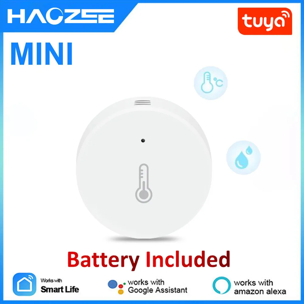
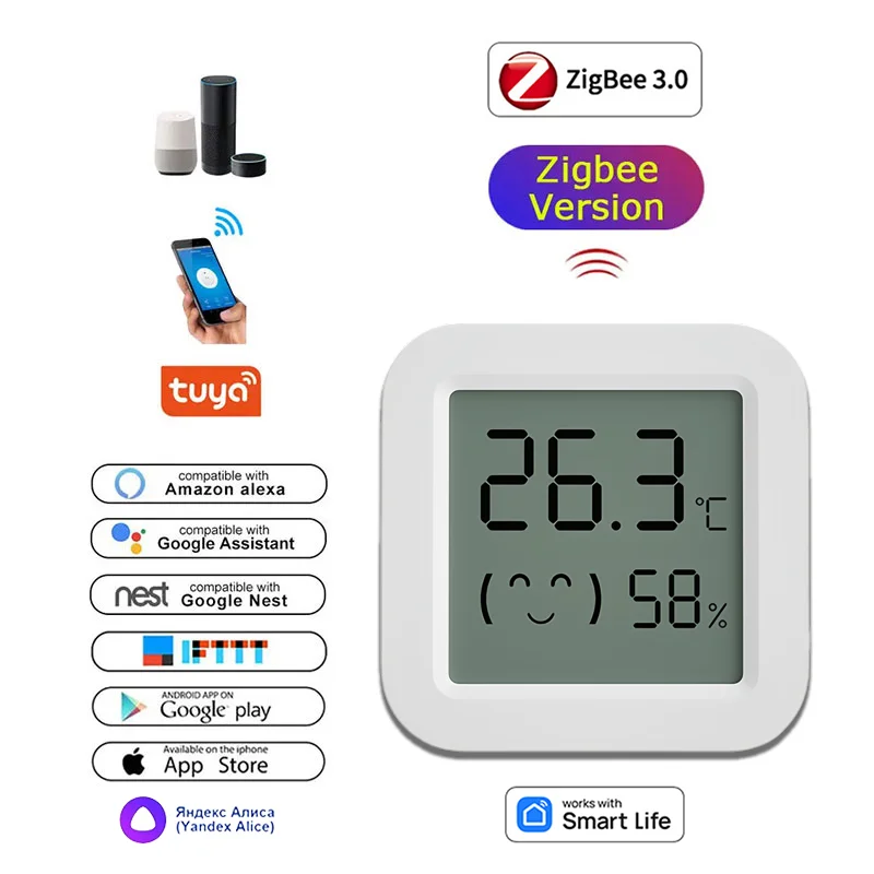
💡 I recommend uploading the images from your file explorer using the Samba Share add-on to the path '/config/www/', which corresponds to '/local/' in the code. For example, you can use the image located at '/config/www/image.jpg' on your cards with the path '/local/image.jpg'.In the header, we will display important information about the room. In my case, I want to show the room’s temperature and humidity percentage (but you can include whatever data you prefer). For this, you’ll obviously need a sensor that provides this information. In my case, I use these types of sensors integrated through Zigbee2MQTT.


You can modify the card header in the following part of the code:
## CARD HEADER
  - type: custom:stack-in-card
    card_mod:
      style: |
        ha-card {
          background: linear-gradient(rgba(0,0,0,0.7), rgba(0,0,0,0.7)), url('/local/habitaciones/dormitorio.jpg'); ## IMAGEN DE FONDO
          background-position: center;
          background-size: cover;
          --primary-text-color: #ffffff;
          min-height: 133px;
        }
    cards:
      - type: custom:mushroom-template-card
        primary: Dormitorio ## ROOM NAME
        secondary: >- ## ROOM SENSORS
          {{ states('sensor.sensor_temperatura_dormitorio_temperature') | int
          }}ºC | {{ states('sensor.sensor_temperatura_dormitorio_humidity') |
          int }}%
        icon: ''
        card_mod:
          style: |
            ha-card {
              border: 0px;
            }
        tap_action:
          action: none
Card Icon
Obviously, the icon represents the room the card is for, and you can customize the color as you prefer. You may have noticed that it has a ring around it of variable length to provide information at a glance. You can associate this with any entity you like (for example, the room’s temperature or the number of items on your shopping list) so the the ring will change based on its value.
Additionally, a badge appears on top when certain conditions are met (which you can customize as you wish).
- If the humidity equals or exceeds 60%, a drop icon with a blue background appears.
- If the temperature equals or exceeds 26ºC, a flame icon with a red background appears.
- If the temperature equals or drops below 18ºC, a snowflake icon with a blue background appears.
You can modify the icon, the ring, and the badges on the card in the following part of the code:
## ICON RING
      - type: custom:apexcharts-card
        card_mod:
          style: |
            ha-card {
              margin-top: -26px;
              margin-bottom: -75px;
              margin-left: -110px;
              border: 0px;
            }
        header:
          show: false
        chart_type: radialBar
        apex_config:
          legend:
            show: false
          chart:
            height: 180px
          plotOptions:
            radialBar:
              hollow:
                size: 70%
              dataLabels:
                name:
                  show: false
                value:
                  show: false
              startAngle: -45
              endAngle: 125
        series:
          - entity: sensor.sensor_temperatura_dormitorio_temperature ## RING ENTITY
            color: aquamarine
            min: 10 ## MIN VALUE OF THE ENTITY
            max: 30 ## MAX VALUE OF THE ENTITY
      - type: custom:mushroom-template-card
        layout: horizontal
        primary: ''
        secondary: ''
        icon: mdi:bed ## ICON
        icon_color: teal ## ICON COLOR
        tap_action:
          action: none
        card_mod:
          style: |
            ha-card {
              border: 0px;
              --icon-size: 100px;
              margin-left: -25px;
              margin-bottom: -55px;
              margin-top: -32px;
            }
            mushroom-badge-icon {
              margin-right: 10px;
              margin-top: 10px;
              --badge-icon-size: 10px;
              --badge-size: 20px;
            }
## CHANGE HERE BADGE RULES
        badge_icon: >
          {% if (states('sensor.sensor_temperatura_dormitorio_humidity') | int)
          >= 60 %} mdi:water {% elif
          (states('sensor.sensor_temperatura_dormitorio_temperature') | int) >=
          26 %} mdi:fire {% elif
          (states('sensor.sensor_temperatura_dormitorio_temperature') | int) <=
          18 %} mdi:snowflake {% endif %}
        badge_color: >
          {% if (states('sensor.sensor_temperatura_dormitorio_humidity') | int)
          >= 60 %} blue

          {% elif (states('sensor.sensor_temperatura_dormitorio_temperature') |
          int)

          >= 26 %} red

          {% elif (states('sensor.sensor_temperatura_dormitorio_temperature') |
          int)

          <= 18 %} blue

          {% endif %}
Side Icons
Side icons will be used to show the status of the room’s devices and to control them (for example, the different bulbs and lamps in the room, or the television). However, you can use them for anything you can think of (such as controlling fans, checking security cameras, etc.).
The card is optimized for you to include between 1 and 6 icons, arranged in 1 or 2 columns. As long as you stay within this range, the card will adapt perfectly to the design. Additionally, you can use conditional styles to change the color of the icons based on the entity’s state, or even animate them.
You can configure the icons in this part of the code:
      - type: custom:stack-in-card
        card_mod:
          style: |
            ha-card {
              background: transparent!important;
              margin-top: -110px;
              margin-left: auto;
              margin-right: 5px;
              width: 44%;
              border: 0px;
            }
        cards:
          - type: grid
            square: false
            columns: 1 ## NUMBER OF COLUMNS (1 OR 2)
            cards:
              - type: custom:mushroom-template-card
                primary: ''
                secondary: ''
                layout: vertical
                icon: mdi:ceiling-light ## ICON DEVICE
                entity: light.bombilla_dormitorio
                icon_color: > ## CONDITIONAL COLOR
                  {% if (states('light.bombilla_dormitorio')) == 'on' %} teal {%
                  endif %}
                card_mod:
                  style: |
                    ha-card {
                      border: 0px;
                      --icon-size: 35px;
                      margin: -10px!important;
                    }
Card Code
The quickest way to create your own room cards is to copy the code I’m going to provide you, create a new manual card in your dashboard, and paste it using the code editor. Keep in mind that you will need to modify the names of your rooms, sensors, and entities, as well as customize the colors as I explained in the previous sections.
Below you can copy the complete code for the cards shown in the example image:
square: false
type: grid
columns: 2
cards:
- type: custom:stack-in-card
card_mod:
style: |
ha-card {
background: linear-gradient(rgba(0,0,0,0.7), rgba(0,0,0,0.7)), url('/local/habitaciones/dormitorio.jpg');
background-position: center;
background-size: cover;
--primary-text-color: #ffffff;
min-height: 133px;
}
cards:
- type: custom:mushroom-template-card
primary: Dormitorio
secondary: >-
{{ states('sensor.sensor_temperatura_dormitorio_temperature') | int
}}ºC | {{ states('sensor.sensor_temperatura_dormitorio_humidity') |
int }}%
icon: ''
card_mod:
style: |
ha-card {
border: 0px;
}
tap_action:
action: none
- type: custom:apexcharts-card
card_mod:
style: |
ha-card {
margin-top: -26px;
margin-bottom: -75px;
margin-left: -110px;
border: 0px;
}
header:
show: false
chart_type: radialBar
apex_config:
legend:
show: false
chart:
height: 180px
plotOptions:
radialBar:
hollow:
size: 70%
dataLabels:
name:
show: false
value:
show: false
startAngle: -45
endAngle: 125
series:
- entity: sensor.sensor_temperatura_dormitorio_temperature
color: aquamarine
min: 10
max: 30
- type: custom:mushroom-template-card
layout: horizontal
primary: ''
secondary: ''
icon: mdi:bed
icon_color: teal
tap_action:
action: none
card_mod:
style: |
ha-card {
border: 0px;
--icon-size: 100px;
margin-left: -25px;
margin-bottom: -55px;
margin-top: -32px;
}
mushroom-badge-icon {
margin-right: 10px;
margin-top: 10px;
--badge-icon-size: 10px;
--badge-size: 20px;
}
badge_icon: >
{% if (states('sensor.sensor_temperatura_dormitorio_humidity') | int)
>= 60 %} mdi:water {% elif
(states('sensor.sensor_temperatura_dormitorio_temperature') | int) >=
26 %} mdi:fire {% elif
(states('sensor.sensor_temperatura_dormitorio_temperature') | int) <=
18 %} mdi:snowflake {% endif %}
badge_color: >
{% if (states('sensor.sensor_temperatura_dormitorio_humidity') | int)
>= 60 %} blue
{% elif (states('sensor.sensor_temperatura_dormitorio_temperature') |
int)
>= 26 %} red
{% elif (states('sensor.sensor_temperatura_dormitorio_temperature') |
int)
<= 18 %} blue
{% endif %}
- type: custom:stack-in-card
card_mod:
style: |
ha-card {
background: transparent!important;
margin-top: -110px;
margin-left: auto;
margin-right: 5px;
width: 44%;
border: 0px;
}
cards:
- type: grid
square: false
columns: 1
cards:
- type: custom:mushroom-template-card
primary: ''
secondary: ''
layout: vertical
icon: mdi:ceiling-light
entity: light.bombilla_dormitorio
icon_color: >
{% if (states('light.bombilla_dormitorio')) == 'on' %} teal {%
endif %}
card_mod:
style: |
ha-card {
border: 0px;
--icon-size: 35px;
margin: -10px!important;
}
- type: custom:mushroom-template-card
primary: ''
secondary: ''
layout: vertical
icon: mdi:lightbulb-variant-outline
entity: light.bombilla_dormitorio_filamento
icon_color: >
{% if (states('light.bombilla_dormitorio_filamento')) == 'on'
%} teal {% endif %}
card_mod:
style: |
ha-card {
border: 0px;
--icon-size: 35px;
margin: -10px!important;
}
- type: custom:mushroom-template-card
primary: ''
secondary: ''
layout: vertical
icon: mdi:television
entity: media_player.tv_dormitorio
tap_action:
action: more-info
icon_color: >
{% if (states('media_player.tv_dormitorio')) == 'off' %} {%
else %} teal {% endif %}
card_mod:
style: |
ha-card {
border: 0px;
--icon-size: 35px;
margin: -10px!important;
}
- type: custom:stack-in-card
card_mod:
style: |
ha-card {
background: linear-gradient(rgba(0,0,0,0.7), rgba(0,0,0,0.7)), url('/local/habitaciones/salon.jpg');
background-position: center;
background-size: cover;
--primary-text-color: #ffffff;
min-height: 133px;
}
cards:
- type: custom:mushroom-template-card
primary: Salón
secondary: >-
{{ states('sensor.salon_temperatura') | int }}ºC | {{
states('sensor.salon_humedad') | int }}%
icon: ''
card_mod:
style: |
ha-card {
border: 0px;
}
tap_action:
action: none
- type: custom:apexcharts-card
card_mod:
style: |
ha-card {
margin-top: -26px;
margin-bottom: -75px;
margin-left: -110px;
}
header:
show: false
chart_type: radialBar
apex_config:
legend:
show: false
chart:
height: 180px
plotOptions:
radialBar:
hollow:
size: 70%
dataLabels:
name:
show: false
value:
show: false
startAngle: -45
endAngle: 125
series:
- entity: sensor.salon_temperatura
color: lightgreen
min: 10
max: 30
- type: custom:mushroom-template-card
layout: horizontal
primary: ''
secondary: ''
icon: mdi:sofa
icon_color: lime
tap_action:
action: none
card_mod:
style: |
ha-card {
border: 0px;
--icon-size: 100px;
margin-left: -25px;
margin-bottom: -55px;
margin-top: -32px;
}
mushroom-badge-icon {
margin-right: 10px;
margin-top: 10px;
--badge-icon-size: 10px;
--badge-size: 20px;
}
badge_icon: >
{% if (states('sensor.sensor_temperatura_dormitorio_humidity') | int)
>= 60 %} mdi:water {% elif
(states('sensor.sensor_temperatura_dormitorio_temperature') | int) >=
26 %} mdi:fire {% elif
(states('sensor.sensor_temperatura_dormitorio_temperature') | int) <=
18 %} mdi:snowflake {% endif %}
badge_color: >
{% if (states('sensor.sensor_temperatura_dormitorio_humidity') | int)
>= 60 %} blue
{% elif (states('sensor.sensor_temperatura_dormitorio_temperature') |
int)
>= 26 %} red
{% elif (states('sensor.sensor_temperatura_dormitorio_temperature') |
int)
<= 18 %} blue
{% endif %}
- type: custom:stack-in-card
card_mod:
style: |
ha-card {
background: transparent!important;
margin-top: -110px;
margin-left: auto;
margin-right: 5px;
width: 44%;
}
cards:
- type: grid
square: false
columns: 2
cards:
- type: custom:mushroom-template-card
primary: ''
secondary: ''
layout: vertical
icon: mdi:floor-lamp
entity: light.bombilla_salon
icon_color: >
{% if (states('light.bombilla_salon')) == 'on' %} lime {%
endif %}
card_mod:
style: |
ha-card {
border: 0px;
--icon-size: 35px;
margin: -10px!important;
}
- type: custom:mushroom-template-card
primary: ''
secondary: ''
layout: vertical
icon: mdi:television
entity: media_player.tv_salon
tap_action:
action: more-info
icon_color: >
{% if (states('media_player.tv_salon')) == 'off' %} {% else %}
lime {% endif %}
card_mod:
style: |
ha-card {
border: 0px;
--icon-size: 35px;
margin: -10px!important;
}
- type: custom:mushroom-template-card
primary: ''
secondary: ''
layout: vertical
icon: mdi:sprout
tap_action:
action: navigate
navigation_path: '#plantas'
card_mod:
style: |
ha-card {
border: 0px;
--icon-size: 35px;
margin: -10px!important;
}
- type: custom:mushroom-template-card
primary: ''
secondary: ''
layout: vertical
icon: mdi:led-strip-variant
entity: light.bombilla_salon
icon_color: >
{% if (states('light.bombilla_salon')) == 'on' %} lime {%
endif %}
card_mod:
style: |
ha-card {
border: 0px;
--icon-size: 35px;
margin: -10px!important;
}
- type: custom:mushroom-template-card
primary: ''
secondary: ''
layout: vertical
icon: mdi:fan
entity: media_player.tv_salon
tap_action:
action: more-info
icon_color: >
{% if (states('media_player.tv_salon')) == 'off' %} {% else %}
lime {% endif %}
card_mod:
style: |
ha-card {
border: 0px;
--icon-size: 35px;
margin: -10px!important;
}
- type: custom:mushroom-template-card
primary: ''
secondary: ''
layout: vertical
icon: mdi:lamp
tap_action:
action: navigate
navigation_path: '#plantas'
card_mod:
style: |
ha-card {
border: 0px;
--icon-size: 35px;
margin: -10px!important;
}
Bonus! Room Cards in HACS!
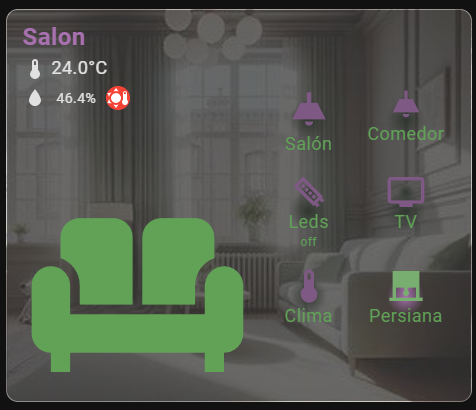
I can’t miss the chance to share with you this version created by our friend Muyayo, inspired by our room cards and available in HACS. If you’re someone who dislikes YAML, you’re going to love it. It’s easy to install and highly customizable! 😊
In his GitHub repository, you can find the different installation methods, as well as the configuration options.
